
The Information that is conveyed visually leaves a much more substantial impact on the viewer than simple text-based information written in long paragraphs. Therefore, data and Information represented visually in the form of Graphs and charts tend to get more engagement.
In WordPress, you can create beautiful charts using the Elementor Addon Elements plugin. The Chart widget of Elementor Addon Elements lets you represent your data graphically in the form of Charts in Elementor without writing a single line of code.
So, here in this tutorial, we will be creating charts in Elementor and configuring them.
Pre-Configuration Requirements
To create graphical charts in Elementor, first, you need to install and activate the following plugins:
Key Takeaways
- Learn how to add charts in Elementor using the free Chart widget.
- Create horizontal bar, vertical bar, and line charts without coding.
- Customize chart styles, axes, tooltips, legends, and animation effects.
- Use multiple datasets and configure chart responsiveness.
- Visually present data for better engagement and understanding.
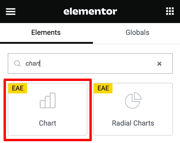
Step 1: Add the Chart widget
Open the page with Elementor; under the Elementor widget panel, search for Chart widget.
Step 2: Customizing the widget
Once you place the widget into the page, you will see a default bar chart layout. For example, using the Chart widget, you can create two types of charts Bar and Line.
So, in this tutorial, we will be configuring both types of charts.
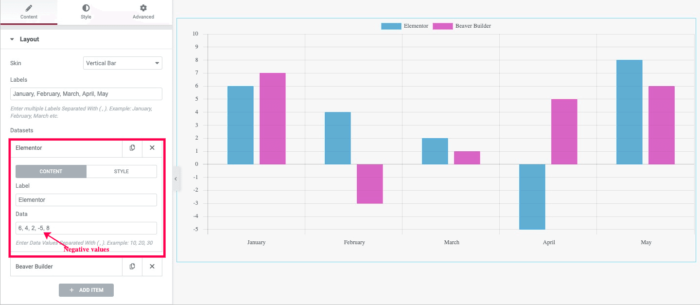
The Layout is the first option under the chart widget. Then, under the Skin option, you need to select the layout style of the chart. Here you can create a Horizontal Bar chart, Vertical Bar chart, or Line chart.
The configuration settings are almost the same for both bar and line charts, and a few options differ for the line chart that we will go through later.
Creating Horizontal & Vertical Bar Chart
Once you have chosen your chart layout, next, you need to add the axis labels. Then go ahead and create your dataset. In the dataset option, by default, two datasets are created. However, you can add multiple datasets just by clicking on the Add Item button. Each dataset comes with two tabs: Content and Style.
Under the Content tab, add the dataset label and the data values. You can add multiple data values separated by a (, ). You can also insert negative values to show declination in your graphs. Next, the Style tab lets you apply custom styling to your chart, like choosing background colors, border colors, etc.
Additional Settings
Once you are done with choosing a chart layout and creating a dataset, next click on the Additional Settings options. Adjust the chart height, then set the Bar and Category width for the Bar chart.
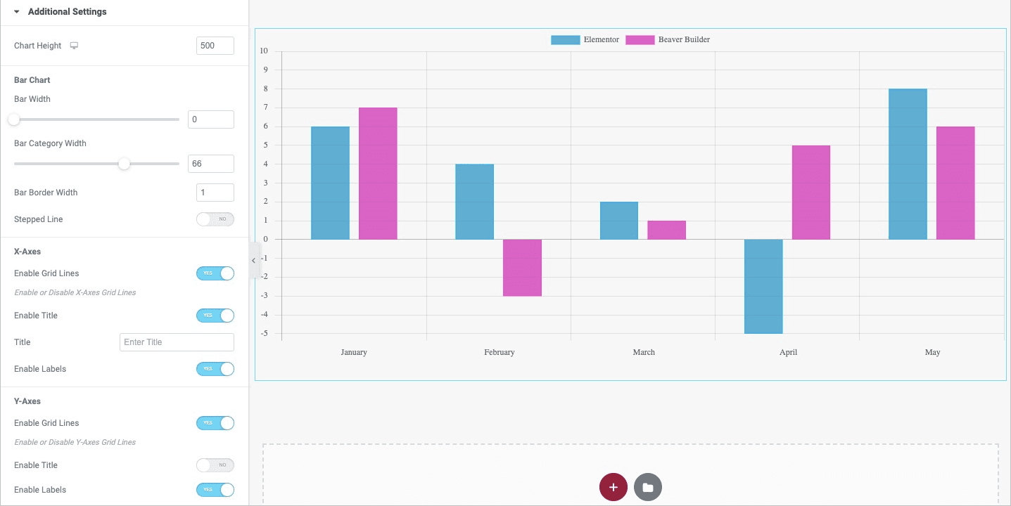
Next, set up the X & Y Axis options. You can enable the options to add Gridlines, titles, and labels. After that, you can also add a numeric number for the number of step count in your chart Axis Scale.
In the Title option, assign the title to the created charted data. Next, there are many other options to add Tooltip, Legend, and Animation to the chart.
Line Chart Settings
When creating line charts in Elementor, there are a few different options. Apart from simple linear lines, you can also create Stepped Lines, adjust the line border width, and the point size for normal and hover stats.
There are also many different styles available for the points to choose from, like circle, cross, rectangle, star, etc. In addition, you can also select line joining styles like round, bevel, and Miter.

Step 3: Styling the Chart
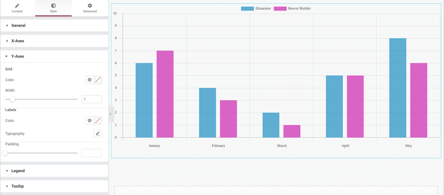
Once you are done with the chart structure, you can apply some styling to it. Under the Style tab, there are various styling controls available to style individual elements of the Chart. There are style settings options for the X-Axis, Y-Axis, Legend, Title, and Tooltip.
That is it; you are done with adding the charts in Elementor Page builder.
Final Preview
Here is the final look of all the charts you can create using the Chart widget.
Vertical Bar Chart

Horizontal Bar Chart

Line Chart

Stepped Line Chart

FAQs on Chart in Elementor
Do I need Elementor Pro to use the chart widget?
No, the Chart widget works with the free version of Elementor and the Elementor Addon Elements plugin.
Can I use custom colors for each bar or line?
Yes, you can style each dataset individually, including background, border, and hover effects.
Is it possible to show multiple datasets in a single chart?
Absolutely! The widget supports multiple datasets for comparative charts.
How do I insert negative values into a chart?
Simply enter negative numbers in the dataset values using commas to separate them.
Are these charts mobile responsive?
Yes, the widget adapts to different screen sizes and works well on mobile devices.
What’s the difference between bar and line charts?
Bar charts are best for comparing quantities, while line charts show trends over time.
Visualize Data Like a Pro With Zero Code
Creating engaging and informative charts in Elementor doesn’t have to be complicated. With the Chart widget, you can turn plain numbers into stunning visuals — all without touching a single line of code. Whether you’re showcasing performance stats, survey results, or comparisons, this widget helps you say more with less.
Ready to give your content a visual boost?
Try the Chart widget today and let your data speak louder than words.


